
Background Information
The project is an exercise published by the University of Edinburgh Enterprise Data Services Team. The audience is Senior managers looking to understand the readiness for the new academic year of projects, activities, and services. The spreadsheet is updated by service owners, project managers, and others for each service. As a data analyst, I have been asked to create a BI dashboard to show the status of projects, services, events, and activities during the start of the new academic year. While considering the characteristics of the data (a small sample dataset), I used Excel, MySQL, and attached Power Query Editors in Power BI to do the basic data cleaning process. Then, I achieved the visualisation in both Tableau and Power BI.

Key metrics
-Display of RAG status by Category
-Display of RAG status by Priority Level including filters for category type
-A Currency of Data indicator to show when data was last updated
-Users wish to drill down where possible to identify specific Services / Projects or activities
Data Clean
Preview
The data was acquired from the attachment of the task brief; it is a CSV file. that contains 11 columns and 81 rows. The dataset passed the ROCCC analysis. It is Reliable (not biased), Original (Locate the original public data), Comprehensive(key information is included), Current (updated by the team) and Cited. 
Find/Replace
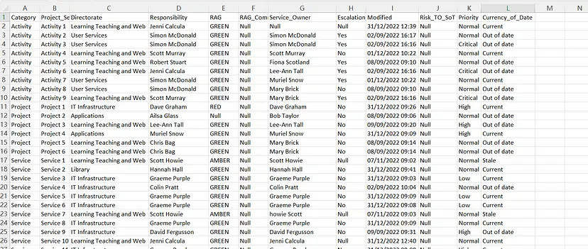
There is some blank value in the original sheet; I used the Find/Replace to replace the blank unit with the text “Null”. Also, in the second column, “Project/Service Title”, the title “Activity” is repeatably used for both categories. Therefore, I changed the title for the category “Welcome Week” to “Event”. 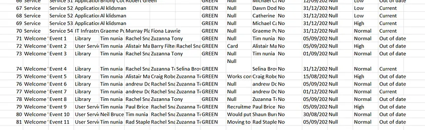
Split the column & LEFT JOIN ()
Furthermore, In the column of “Responsibility”, we see multiple names appearing side by side. According to the above goals, we need to ensure that the records can be queried more conveniently. So, I split the column and then used LEFT JOIN() in MySQL to create a record for each person’s name for further easy querying.
CREATE VIEW responsibility AS SELECT
Responsibility,
ID
FROM
 tracker;
CREATE VIEW responsibility1 AS SELECT
Responsibility1 AS Responsibility,
ID
FROM
 tracker;
CREATE VIEW responsibility2 AS SELECT
Responsibility2 AS Responsibility,
ID
FROM
 tracker;
CREATE VIEW responsibility3 AS SELECT
Responsibility3 AS Responsibility,
ID
FROM
 tracker;
CREATE VIEW tracker_others AS SELECT
ID,
Category,
Project_Service_Title,
Directorate,
RAG,
RAG_Comment,
Service_Owner,
Escalation_to_SLT,
Modified,
Risk_TO_SoT,
Priority,
Currency_of_Date
FROM
 tracker;
CREATE VIEW trakcer_others_responsibility AS SELECT
Responsibility,
tracker_others.ID,
Category,
Project_Service_Title,
Directorate,
RAG,
RAG_Comment,
Service_Owner,
Escalation_to_SLT,
Modified,
Risk_TO_SoT,
Priority,
Currency_of_Date
FROM
 tracker_others
 LEFT JOIN responsibility ON responsibility.ID = tracker_others.ID;
CREATE VIEW trakcer_others_responsibility1 AS SELECT
Responsibility,
tracker_others.ID,
Category,
Project_Service_Title,
Directorate,
RAG,
RAG_Comment,
Service_Owner,
Escalation_to_SLT,
Modified,
Risk_TO_SoT,
Priority,
Currency_of_Date
FROM
 tracker_others
 LEFT JOIN responsibility1 ON responsibility1.ID = tracker_others.ID;
CREATE VIEW trakcer_others_responsibility2 AS SELECT
Responsibility,
tracker_others.ID,
Category,
Project_Service_Title,
Directorate,
RAG,
RAG_Comment,
Service_Owner,
Escalation_to_SLT,
Modified,
Risk_TO_SoT,
Priority,
Currency_of_Date
FROM
 tracker_others
 LEFT JOIN responsibility2 ON responsibility2.ID = tracker_others.ID;
CREATE VIEW trakcer_others_responsibility3 AS SELECT
Responsibility,
tracker_others.ID,
Category,
Project_Service_Title,
Directorate,
RAG,
RAG_Comment,
Service_Owner,
Escalation_to_SLT,
Modified,
Risk_TO_SoT,
Priority,
Currency_of_Date
FROM
 tracker_others
 LEFT JOIN responsibility3 ON responsibility3.ID = tracker_others.ID;
CREATE TABLE new_table AS SELECT
*
FROM
 trakcer_others_responsibility UNION ALL
SELECT
 *
FROM
 trakcer_others_responsibility1 UNION ALL
SELECT
 *
FROM
 trakcer_others_responsibility2 UNION ALL
SELECT
 *
FROM
 trakcer_others_responsibility3;
DELETE
FROM
 new_table
WHERE
 Responsibility IS NULL;
CREATE TABLE output_table AS SELECT
Category,
Project_Service_Title,
Directorate,
Responsibility,
RAG,
RAG_Comment,
Service_Owner,
Escalation_to_SLT,
Modified,
Risk_TO_SoT,
Priority,
Currency_of_Date
FROM
 new_table;

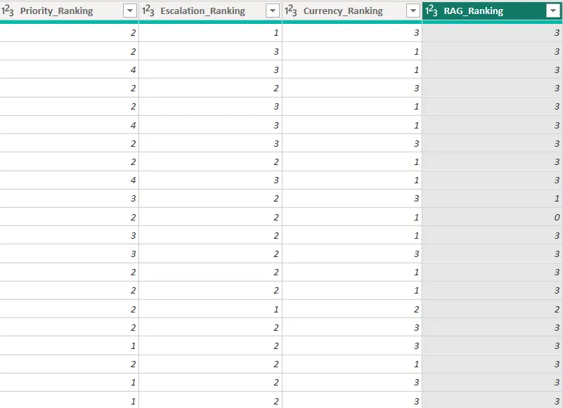
### Create a currency of data indicator Then, a currency of data indicator to show when data was last updated is needed. To achieve that, I first used the Month() function based on the date/time in the “Modified” column to get the month of each record, and then I created a new column “, Currency_of_Date” and used the IF() function based on the condition of the different month.
If(M:M=12,"Current",if(M:M>=10,"Stale","Out of Date" ))
Now the database is settled and can be used as the source for data visualization.
Data visualizing
Tableau
First, the CSV file had been added to the Tableau connection; one great benefit of this data visualization tool is that it will automatically identify the data types for different fields. 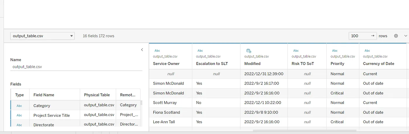 Second, I created serval calculation fields to create more meaningful labels for date-based data in visualization and help audiences view information much more conveniently.
# To group or filter data based on the month and create a visual representation of data over time
MONTH([Modified])

# Extract the name of a specified weekday part from the date field.
DATENAME("weekday",[Modified])
IF function in Tableau is used to perform conditional logic in calculations. It allows the creation of a calculation that returns one value. I utilise the IF function here to replace text values with beautiful symbols.
IF [Escalation to SLT]="Yes" THEN "✅"
ELSEIF [Escalation to SLT]="No" THEN "❎"
ELSE "?"
END

IF [Priority]="Critical" THEN "⭐⭐⭐⭐"
ELSEIF [Priority]="High" THEN "⭐⭐⭐"
ELSEIF [Priority]="Normal" THEN "⭐⭐"
ELSE "⭐"
END
Then, I created several worksheets by combining different fields together into suitable charts, tables and diagrams and adding filters. I.E., By combing the Calculate Field “Month” and Counting the distinct numbers of activities, events, projects and services to create a monthly trend line chart. 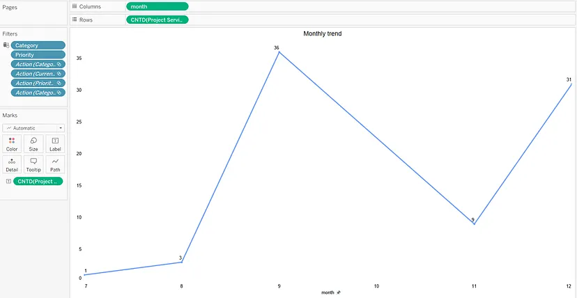
A horizontal bar chart could be created by combing Priority Level and Counting the distinct numbers of activities, events, projects and services together with the mark of RAG status and filters of Category. 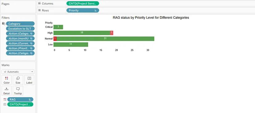 Finally, I put all the worksheets together and created a dashboard to demonstrate all the information, and the dashboard can be accessed here.
Power BI
The first step is similar, connecting the database to the application, or more accurately, the inner editors (Power Query editors). The attached Power Query editors allowed additional processing of the data. Actually, additional steps are also needed because some of the functions are not that automotive compared to Tableau, and the default system settings cause some bugs to need to be changed.

The first thing is using the first row as a header when the database is uploaded.
M Language #"Promoted Headers" = Table.PromoteHeaders(#"Changed Type", [PromoteAllScalars=true]) Also, the text values can not be directly replaced by icons using the IF() function in tableau. Therefore, conditional columns must be added to transfer string value to integer value.
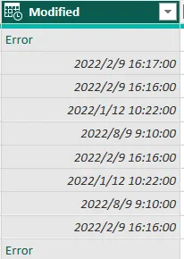
When I attempt to change its type to Date/Time, I get the following data format. Error, it couldn’t parse the input provided as a DateTime value. The error is occurring due to the system’s default setting; the data format should be rearranged.
Now, the data sources are ready to be visualized in the Dashboard. I added some new DAX measures for creating calculations and aggregations on data in a Power BI report or dashboard. These measures can be used to summarize data, calculate running totals, detect update time, and in combination with other DAX functions to create more complex calculations.
The final steps are the same as in Tableau: combining different fields and adding filters to generate different icons to interpret and analyze data types. The report can be accessed here 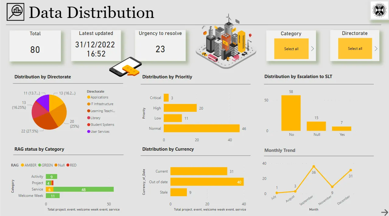
Insights
Most of the events, acitivits, services, or projects happened in Learning Teach and Web.
Most of the record are out of date, and 31 records happened currently.
September and Decmeber are all busy months, the team should be prepared ahead.
Servicies had the highest number of recorded, and most of the RAG status are marked Green.
Most of the records are not escalated to SLT, and the team should be awareness of that.
Conclusion
Tableau and Power BI are powerful data visualization and business intelligence tools that can create interactive dashboards, charts, and reports from various data sources. Both platforms offer a drag-and-drop interface for creating visualizations and a wide range of pre-built visualizations and charts. They both offer the ability to connect to various data sources, including Excel, SQL Server, and cloud-based data sources.
However, there are also some key differences between the two. Tableau has more advanced mapping capabilities, which allows for more detailed spatial analysis. Power BI does have mapping capabilities, but it is less advanced. Tableau offers more flexible and advanced analytics, such as forecasting, clustering, and statistical models. Power BI, on the other hand, primarily focuses on providing business intelligence, more advanced calculation ability, and data visualization capabilities for Microsoft products, such as Excel and SQL Server.
When deciding between the two platforms, it is important to consider the specific needs of your organization and the data you are working with. Tableau is likely the better choice for projects requiring advanced spatial analysis. For projects that focus on business intelligence and complex calculations such as (P/E Ratio, consumer index, and cash flow). Power BI may be more suitable. Both platforms are very powerful, but by understanding their specific capabilities, we can make informed decisions and utilize them most effectively.
That’s the end of the project. Thank you for Reading, Hooyah!